
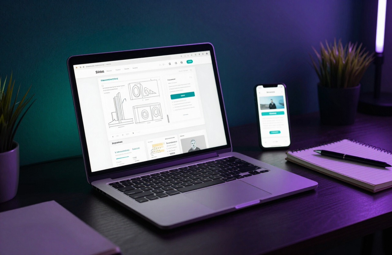
Visitors reach your site on phones, tablets, laptops and large desktop monitors — sometimes all in one day. Responsive web design ensures your site looks and works well on every one of them. As a web design company in Bangalore, we build every site responsive. Here is what that means.
What is responsive web design?
Responsive design uses flexible layouts, fluid grids and CSS media queries to adapt a single site to any screen size. Instead of building separate mobile and desktop sites, you build one that reflows gracefully as the viewport changes.
Why responsive matters
A responsive site serves every visitor well, no matter their device. It improves user experience, supports SEO through mobile-first indexing, and is easier to maintain than multiple separate sites.
Fluid grids and flexible layouts
Instead of fixed pixel widths, responsive design uses relative units and flexible grids. Content reflows and resizes proportionally, so a three-column desktop layout might become a single column on a phone.
Flexible images and media
Images and videos should scale with their containers, never overflowing the screen. Modern techniques like srcset let you serve appropriately sized images to each device — a key part of performance optimization.
Media queries
Media queries apply different styles at different breakpoints. They let you adjust layout, font sizes and spacing for phones, tablets and desktops so each gets a tailored experience.
Touch and pointer differences
Phones use touch; desktops use mice. Responsive design accounts for this with larger tap targets on mobile and hover states on desktop. This overlaps with good UX and mobile-first design.
Accessibility benefits
Responsive sites are easier to use with screen readers and zoom tools because content reflows rather than requiring horizontal scrolling. Learn more in our web accessibility guide.
One URL, simpler SEO
A single responsive site means one URL per page, which concentrates your search ranking signals. Separate mobile sites split authority and add maintenance overhead.
Future-proof your site
New devices with new screen sizes arrive constantly. Responsive design is inherently future-friendly — your site adapts to screens that do not even exist yet. If your current site is not responsive, a website redesign with a website designing company in Bangalore is a smart move.
Thanya Tech Team
Web Design & Digital Marketing Experts
The Thanya Tech team builds websites, ecommerce stores and digital marketing campaigns for businesses across Bangalore. With 5+ years of experience, we share practical insights to help you grow online.
Published 4 March 2025 · Back to blog