
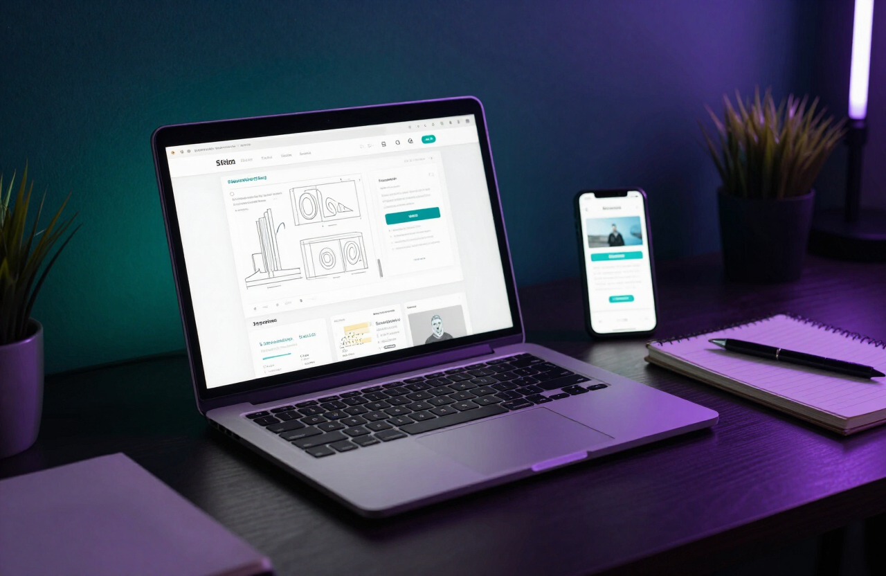
For most Bangalore businesses, the majority of website visitors arrive on a smartphone. Designing for the smallest screen first — and then scaling up — is the most reliable way to serve them well. As a web design company in Bangalore, we build every site mobile-first. Here is why it matters.
Mobile is where your customers are
From commuters on the metro to shoppers in Jayanagar markets, your audience is on mobile. A site that is hard to use on a phone quietly loses a large share of its potential customers.
Google uses mobile-first indexing
Google predominantly uses the mobile version of your site for indexing and ranking. If your mobile experience is weak, your rankings suffer. Mobile-first design is therefore also an SEO strategy. Learn more in our SEO-friendly web design guide.
It forces better priorities
When you design for a small screen first, you have to decide what truly matters. There is no room for clutter. This discipline produces cleaner, more focused designs that also work better on desktop.
Faster load times on every device
Mobile-first design favours lightweight layouts, fewer heavy elements and optimised images. The result is a faster site for everyone — a win for both users and search engines. See our performance optimization tips.
Touch-friendly by default
Mobile-first means buttons, links and forms are sized for fingers, not mouse pointers. Tap targets of at least 44px, generous spacing and simple forms all reduce frustration and abandoned actions.
Better conversion on mobile
A smooth mobile checkout or enquiry flow converts far better than a pinched, cramped desktop layout. This directly impacts revenue for ecommerce and lead-gen sites alike. Pair it with conversion rate optimization for compounding gains.
Responsive, not separate
Mobile-first does not mean a separate mobile site. It means one responsive site that adapts gracefully from phone to tablet to desktop. A single codebase is easier to maintain and keeps your SEO signals unified.
Accessibility improves too
Many mobile-first practices — large text, clear contrast, simple navigation — also improve accessibility. Read our web accessibility guide to see how the two overlap.
Make mobile-first your default
If your site was built desktop-first years ago, it is probably underperforming on the devices your customers use most. A website redesign with a mobile-first approach is often the highest-ROI upgrade you can make. Thanya Tech, a website designing company in Bangalore, can help you make the shift.
Thanya Tech Team
Web Design & Digital Marketing Experts
The Thanya Tech team builds websites, ecommerce stores and digital marketing campaigns for businesses across Bangalore. With 5+ years of experience, we share practical insights to help you grow online.
Published 4 February 2025 · Back to blog